Showing posts with label river and trees painting. Show all posts

Saturday, July 2, 2011

A Rare Summer Day

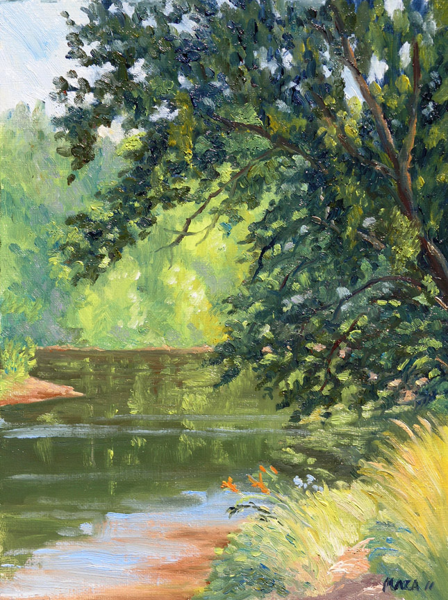
Summer at Daniels Area, oils on canvas panel, 12" x 9."

It was one of those rare summer mornings, unusual for the DC area--cool and with the air so clear it felt more like early fall, or perhaps Canada. The Howard County Plein Air group was painting at the Daniels Area of  Patapsco Valley State Park, a favorite site of mine.


Deborah Maklowski was already set up and sketching when I arrived, and there were a bunch of young women putting out canoes on the river. A canoe transport trailer and cars took up all the room in the parking lot, so I pulled up by the side of the road to park. The girls were from Baltimore's inner city on a special job corps program, and most of them looked as if they'd never been on a canoe before. Eventually, they and their leaders launched off on their trip and things quieted down some, although people came by all morning to launch kayaks, canoes, and even one inflatable boat. It was a great day to be on the water.


I wanted to get as close to the water as possible, but it was hard to find a spot out of the traffic. I managed to set up my easel on the slope of the bank under the thick shade, adjusting the tripod for the steep slope, and sketched out my composition.

I usually start my painting with the sky to establish the light, but today I started with the tree overhanging the water, going in really dark, then painting the areas around it, adjusting the colors against it. I think the approach worked in general, but I would have liked to get better modeling of the tree itself. I should have tried for more variation between the color of branches closer to the viewer and those farther away, to give the tree a more three-dimensional effect. As I strive to do better with each painting, every time I achieve one thing I see other missed opportunities. When does one finally--if ever--manage to get it all down?

Friday, September 10, 2010

Watercolor vs Oils

The Patapsco River at McKeldin Area, oils on canvas panel, 9" x 12"
Last weekend I went out to paint with a friend at the Mc Keldin Area of Patapsco State Park. It was a gorgeous morning, sunny and clear, with just a hint of fall in the air. We were at a trail just below the rapids where there is a wide pool before the river turns its course to flow through the forest.

I chose this view because the light coming through the leaves of this small sycamore maple was so lovely: the light breeze set the leaves to dancing and the water beyond glinted in the sunlight. I was working in oils and Mary Jo in watecolor; we worked on our paintings for about three hours, until the sun was high overhead. By this time huge clouds had gathered and the wind was picking up speed. Mary Jo didn't seem too happy with her painting--she doesn't use watercolors often--and I could see there were some problems with her work. Her strokes were much too much the same throughout the surface, with not enough color variation to give a sense of the space, of foreground and background.

After I got home and looked at my painting again, it seemed to me that mine had lost a good deal of that initial sense of light, of the warm light and shadows in the foreground against the cool background. This can easily happen as the light changes rapidly, and my work had clearly suffered from this confusion.

The next day I decided to paint the same scene, this time using watercolors, which I haven't worked much for the past year. I had some reference photos I had taken when I was finishing my oil painting.

The Patapsco River at McKeldin Area, watercolor, 10" x 14"
I think the watercolor is much more successful than my oil (it's cooler in color overall, since the photo was taken as the sky was becoming overcast). The background in the watercolor remains more nebulous and cooler, while the foreground leaves, despite a soft focus, are in the proper relationship. The real difference, however, is the value of the tree-trunk, which should have been much darker and cooler in the oil to make it pop to the front. The distance should have been lighter and bluer in the oils to make it recede.

In the watercolor the softer darks on the left are more suggestive, it could be a footbridge or merely trunks, but they balance the darks of the tree trunk on the right, so the composition reads better. This illustrates perfectly a case where, as Mies Van de Rohe said, "Less is more." I must learn to restrain my impulse to put everything in minute detail into my paintings, in order to subordinate all other elements of the composition to the focal point. Somehow, I find this easier to do in watercolor than in oils. Could that be because I've learned to plan my watercolors more methodically or does the medium lend itself more to simplification? Hmmm...

Wednesday, May 12, 2010

More of College Creek

College Creek #3, oils on canvas panel, 11" x 14." Contact artist for price.

Our class was back at College Creek this week tackling the same subject again. Sometimes it's useful to go back to paint the same site over and over--Monet and other great painters did this to great effect--but it can be a bit challenging for the student.

I wanted to vary my composition as well as color from the previous week's, so this time I opened up the frame a bit to include some vegetation in the foreground and repositioned the turn in the creek more towards the center. I think I managed to get a more pleasing composition this way, and the colors are more varied than in last week's painting. I"m using more and more paint these days--I'll have to make a run to the art store soon to replenish my supplies.